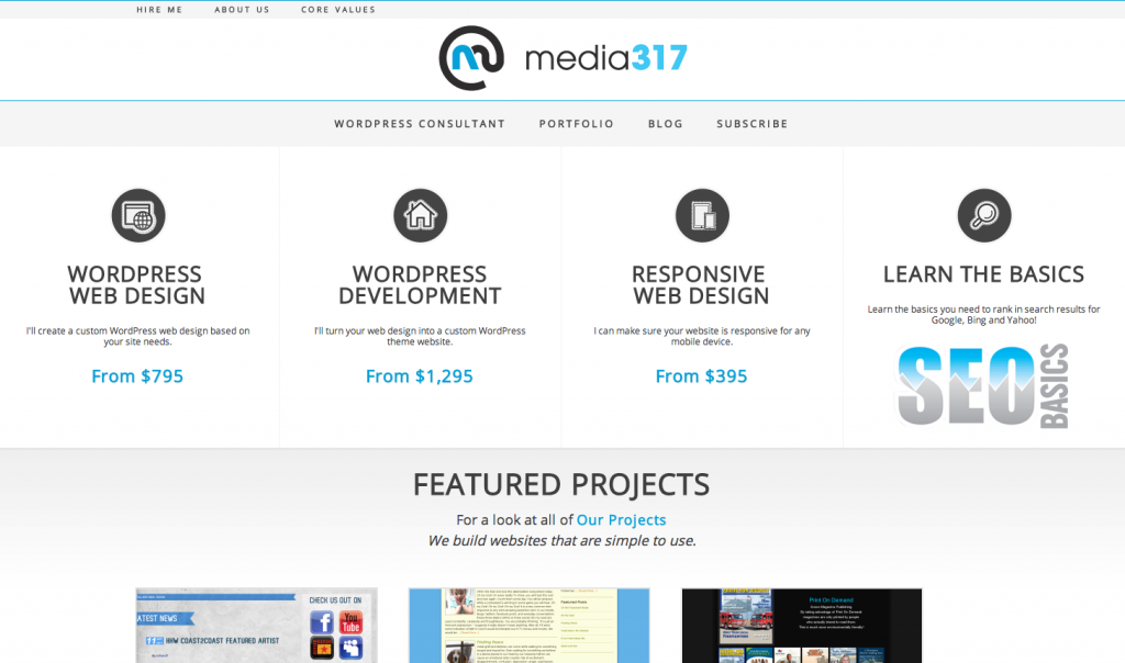
After several weeks of work, I am pleased to announce the release of the new Media317 website. It will provide a better user experience for all devices, desktop or mobile.

Web 3.0
The world of the internet is changing. We have transitioned from web 1.0 to web 2.0 and we are now in the transition to web 3.0. This new world of the internet is driven by mobile. A recent Pew study found that nearly half of adults are using smartphones daily. Mobile devices from phones to tablets are becoming the standard for users accessing the internet.
Google has recently conducted a study and found that 72% of consumers want to visit a website that is mobile friendly. The current reality, however, is that the majority of websites are not mobile friendly. This is costing you visitors and business.
Mobile Baby!
Realizing that the web is changing, I wanted to make sure Media317.net was ready for the future. So I set out to design a site that would be very mobile friendly and very centered on the core business of Media317.
The Design
It is important for me to make sure the website provides you with a good user experience. Buttons are larger so they are easier to use on mobile screens. The navigation has been streamlined to help users navigate more efficiently through the site.
I wanted to make sure that the color palette was easy on the eyes, yet maintained consistency with Media317 branding. By using black text on white background, the contrast is ideal for reading. And by adding touches of color through out the site, there is a consistency with the branding.
We increased the overall whitespace on the site. By increasing the font size, the pages are easier to read on desktop and mobile devices.
Responsive
A modern design must be mobile friendly. When I developed the theme for the site, I used modern CSS and programing to make sure the site would adapt to the users browser and screen size.
Adjust the browser size and watch how things move around the site. You’ll see the content area reduce in width, the header will adjust, the navigation changes, the sidebar drops below the content area. Watch as the site adjust to your screen. It is completely responsive and maintains the site design regardless of screen size or resolution. If you have a mobile device, pull up the page and change the screen from portrait to landscape.
Responsive web design becoming more and more important in modern web design.
More to Come
I am very excited about the growing trend and changes in WordPress and web design.
Mobile devices are not going away. They make up a large percentage of web traffic and the number is growing. Soon, over half of all internet traffic is going to be from users on mobile devices.
The responsive design approach is a game changer for modern web design. It allows site owners to reach the mobile user without having to develop and maintain two separate sites.
What do you think of the site? I appreciate your feedback and your comments. Shout off in the comments below.
Leave a Reply